 Last week I posted data showing how WA and Australia compares against European Countries in terms of fatal crashes per million people.
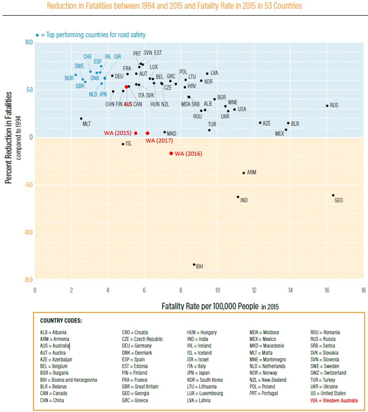
Above is a graph showing how Australia compared with 52 Countries in terms of the reduction in Fatalities per 100,000 people from that recorded in 1994 and 2015. I have added WA data to this showing 2015, 2016 and 2017 reductions. There have been many comments regarding the use and relevance of using crash rates per population numbers with suggestions that I should be using crash rates per million vehicle km's travelled. Ideally crash rates for all Countries should be published in three different standard formats (per population, per km's travelled and per licensed vehicles for example). The reality is that each Country, and even some states, calculate million vehicle kms travelled differently with most based on a combination of the number of vehicles and the amount of fuel sold. The only consistent crash rates that I have been able to find is per 100,000 or million people. But all of this distracts from the stark reality that WA has a shocking road safety record regardless of how you look at it. To bring about a significant change in this we need a significant change in how we are tackling it.
0 Comments
Leave a Reply. |
AuthorDavid Wilkins, Principal & Senior Traffic Engineer. Archives
August 2023
Categories
All
|
 RSS Feed